Motion Sync Case
Motion Sync is a startup developing a smart pillow that reduces motion sickness through predictive haptic feedback. As a UI/UX designer, I worked on shaping the end-to-end experience across both web and mobile.

My Role
UI/UX Designer
I worked on the web and mobile experience for Motion Sync, focusing on how to help users understand, trust, and interact with a new smart pillow product.
My role included organizing product information, designing website sections, creating mobile app screens, and improving the overall user journey from product discovery to usage.
Web Design Core Problem
As an emerging product, Motion Sync introduced a completely new concept that users were unfamiliar with.
During early exploration, several challenges became clear:
-
Users struggled to understand how the product works
-
The value proposition was not immediately clear
-
Information felt unstructured and overwhelming
-
Lack of trust in a new and unseen technology
Users were curious, but hesitant to take action due to uncertainty.
Insight
Users don’t reject the product — they hesitate because they don’t understand it. For a new product category, understanding is the biggest barrier to adoption.
Web Page Design
-
Simplify complexity — Break down the system into clear, digestible steps
-
Make the invisible visible — Use visuals to explain abstract technology
-
Guide, don’t overwhelm — Structure content progressively
-
Build trust gradually — Support user confidence through clarity and context
The goal was to translate complex technology into a simple, intuitive experience.


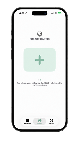
App Experience — Interaction & Control
The mobile app was designed as a companion experience that enables real-time interaction with the product.


Cross-Platform Thinking
Rather than treating web and app as separate products, I designed them as a connected experience.
-
Website → builds awareness and trust
-
App → enables usage and interaction
Together, they support a complete user journey:
Discovery → Understanding → Decision → Usage
This ensures users not only learn about the product, but can seamlessly adopt it in real life.
Impact
Although the product is still evolving, the design improvements contributed to:
-
Improved clarity of product understanding
-
Reduced user confusion during exploration
-
Increased confidence in trying a new solution
The design helped lower the psychological barrier to adopting a new product.
Reflection
This project taught me that:
Designing for new product categories requires education, not just UI
Simplifying complex systems is essential for usability
UX design is not only about visuals, but about shaping how users think and understand
This project was less about visual, and more about helping users understand, trust, and adopt a completely new experience.